


 by
by 

Quilters don’t typically buy on impulse. They match colors to existing projects, coordinate prints, and choose fabrics that need to work together perfectly.
Poor lighting distorts what customers see. A cream fabric looks yellow under warm bulbs. Complex batiks lose their depth. Customers walk to the window because they don’t trust your overhead lights.
This blog shows you how to fix this. The right bulbs reveal true color instead of distorting it. Proper positioning eliminates shadows at your cutting table. When customers trust what they see in your shop, they buy more confidently and return less frequently.
Related Read: Fabric Store Design: 7 Tips To Create an Excellent Shopping Experience
Why Accurate Lighting Drives More Sales
Clothing stores can get away with warm, flattering lights. Customers care more about how they look in the mirror than perfect color rendering.
Quilt shops can’t. Quilters need fabrics that fit existing projects, patterns with specific color requirements, or photos they’ve seen online. Off by even a shade? The quilt doesn’t work.
Here’s what happens when your lighting isn’t doing its job:
- Poor lighting shrinks basket sizes: A customer walks in looking for one fabric. She finds it, but coordinating colors look off under your lights. She can’t tell what works together. Playing it safe, she buys only what she came for.
- Good lighting encourages add-on purchases: When shoppers trust what they’re seeing, they grab coordinating prints confidently. They build bundles, try new color combinations, and as a result, your average transaction value climbs.
- Accurate lighting reduces returns: A customer buys fabric under warm bulbs. At home, the white she purchased looks cream next to her other materials. She drives back to return it. You’ve lost the sale, frustrated a loyal shopper, and wasted staff time processing the return.
- Better lighting improves merchandising: Coordinated fabric bundles look cohesive when your fixtures reveal true color. Feature displays pop, and shoppers accept your suggestions because they can verify that the colors work together.
- Online-to-in-store consistency builds trust: Your e-commerce photos should match what people see in your store. When they do, shoppers order online and pick up later without hesitation. No surprises. No disappointment.

5 Ways To Fix Your Quilt Shop’s Lighting
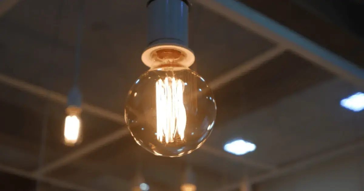
You can’t fix your lighting problems by guessing. If you’re still using fluorescent or halogen bulbs, switching to LED is the single most important upgrade you can make.
Fluorescent bulbs only show about 80% of a fabric’s true colors. LEDs show 90% or more. That’s as close to natural daylight as you can get with artificial lighting. Your customers see fabrics the way they actually look instead of walking to the window to double-check colors.
Fluorescent bulbs also shift color as they age. New bulbs look different from old bulbs, so your lighting becomes inconsistent. LEDs maintain the same color output for 50,000 hours.
Halogen bulbs produce heat that fades fabrics and UV light that damages delicate materials. LEDs run cool and don’t emit UV.
The average quilt shop cuts its lighting bill by 60–75% after switching to LED.
1. Choose 4,000 K–5,000 K Bulbs for True Color
Color temperature is measured in Kelvin (K). Lower numbers are warm and yellow, while higher numbers are cool and blue.
For quilt shops, aim for 4,000 K–5,000 K. This neutral range provides accurate color rendering without the yellow cast of warm bulbs or the harsh blue of very cool bulbs. Whites look white. Prints show their true colors. Quilters can trust what they see.
What happens when you get it wrong: Warm 2,700 K–3,000 K bulbs turn white fabrics cream and make cool-toned prints look muddy. A customer shopping for bright white sees yellow. They buy it anyway, take it home, and return it because it clashes with their project.
How to test it: Hold a bright-white solid under your lights. Does it look cream, yellow, or blue? It should look pure white. If not, your color temperature is wrong.
2. Use High-CRI Bulbs (90+) To Show Fabric Details
CRI (Color Rendering Index) measures how accurately a light source renders colors compared to natural sunlight. Bulbs with a CRI below 80 can flatten complex prints.
High-CRI bulbs (90+) reveal the full color spectrum. Batiks look rich instead of one-dimensional, hand-dyed fabrics display their gradients, and tone-on-tone prints reveal subtle variations that make them special.
What happens when you get it wrong: Low-CRI bulbs make batiks look flat and boring — the depth and undertones disappear. Shoppers pass on fabrics they’d love if they could actually see them properly.
How to test it: Pick three similar but slightly different fabrics. Check them under your lights. Are the subtle color differences clear? If they all look identical, your CRI is too low.
3. Install Consistent Lighting Throughout Your Store
Don’t mix 4,000 K bulbs in one section and 5,000 K in another. Use the same bulb type and wattage everywhere.
Why consistency matters: A customer brings three bolts to your cutting table. Under the overhead lights near your register, they coordinate perfectly. At the cutting area, different lighting makes the fabrics look off. One looks bluer, while another looks more purple. The customer second-guesses the choices and leaves without buying.
How to fix it:
- Install recessed can lights or track lighting on a grid pattern.
- Avoid creating bright spots and dark corners.
- Make sure display-wall lighting uses the same bulbs as your overhead fixtures.
How to test it: Walk through your store with a bolt of fabric. Does it look the same color everywhere? Or does it shift depending on where you’re standing?
4. Add Bright Task Lighting at Your Cutting Table
Your cutting table is where customers make final decisions. It’s also where your staff works most carefully.
General overhead lighting isn’t enough. Target 75–100 foot-candles at the cutting surface. Foot-candles measure how much light actually reaches a surface. For reference, a bright office has about 50 foot-candles. You need more at your cutting table because precise work requires higher visibility.
What happens when you get it wrong: Shadows make it hard to see selvage edges clearly, so your employee cuts slowly to avoid mistakes while customers wait. Some get impatient and leave.
How to fix it: Install adjustable task lights directly over the table. LED strips mounted under upper cabinets or articulating desk lamps work well. Position lights so they illuminate the fabric without creating shadows. Your employee shouldn’t have to move their body to see what they’re cutting.
How to test it: Stand at your cutting table and hold fabric where you typically cut. Can you see selvage edges clearly without shadows? If your employee has to lean or move to avoid shadows, you need better task lighting.
Related Read: Fabric Samples: How To Turn Browsers Into Buyers
5. Control Natural Light To Prevent Fading and Glare
Big windows bring in customers and create an inviting atmosphere — but uncontrolled sunlight causes problems.
What happens when you get it wrong: Direct sun fades fabrics on your displays and creates harsh shadows that make color matching impossible during certain times of day.
How to fix it: Use UV-filtering window film or sheer curtains to diffuse natural light. Position your cutting table near windows so shoppers can verify colors in daylight if they want. But make sure your artificial lighting works well enough that they don’t need to.
How to test it: Walk through your store at different times of day. Do you see sun spots on fabric displays? Are there harsh shadows in the morning or afternoon? If yes, you need UV filtering or diffusion.
What Like Sew Delivers for Quilt Shop Owners
Like Sew is a point of sale (POS) system built specifically for quilt shops. It doesn’t control your lighting, but once your setup is fixed, it helps you track what happens next.
Shoppers who trust what they see buy more coordinating fabrics. Like Sew tracks which combinations sell together, so you can merchandise those pairings prominently.
Better lighting also improves online-to-in-store consistency. Customers pick up online orders without surprises because your in-store displays match your e-commerce photos. Like Sew’s reporting shows you which items drive online orders and which get returned.
Returns drop because customers made the right choice the first time. You spend less time processing returns and more time serving new shoppers.
Quilt shops that grow create environments where customers make decisions with certainty. That starts with lighting that shows fabric accurately and extends to a POS system that highlights what’s working. Schedule a demo to see which fabric combinations are driving your sales.


