


 by
by 

Quilters don’t shop for fabric the same way people shop for hardware or groceries.
Instead of relying on logic and lists, customers are shopping for a feeling. They’re looking for a color story that clicks or waiting for a creative spark to hit them while they roam your store.
The colors you display, how you group them, and where you place them on your floor all shape your customer experience — including how long customers stay, what they pick up, and how much they spend.
Understanding the relationship between color psychology and buying behavior is critical to running a successful quilt shop. In this blog, we’ll explore the basics of color psychology and show you how to apply it to your fabric store design.
How Color Psychology and Buying Behavior Shape Quilt Shop Sales
Let’s start with the basics: What is color psychology?
Color psychology is the study of how colors influence a person’s emotions and behavior. Different colors can trigger different responses, and those reactions often vary based on culture and lived experiences.
This concept plays out on your shop floor every day, whether you or your customers realize it. Quilt shop customers are looking for more than individual colors when they browse fabric bolts. They’re looking for color relationships.
When a quilter can see how colors, patterns, and styles work together on your shelves, it becomes easier to envision pulling it off in a quilt at home. Nail color psychology in your store, and you’re selling confidence — and a confident quilter is a quilter who buys.
Related Read: 10 Retail Customer Service Tips for Fabric Stores

5 Ways To Implement Color Psychology in Your Quilt Shop
Here’s how to use color psychology to your advantage in your quilt shop. Boost sales and draw customers in with these five tips.
1. Leverage Your Color Wall
If you’re treating your color wall as a storage solution, you’re missing out on a major opportunity. When you design your color wall properly, it can turn those fabric displays into your store’s best salesperson.
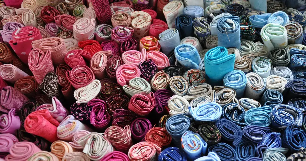
According to color psychology, warm tones are great for pulling people in. Reds, golds, deep rusts, and burnt oranges are high-energy, which is why your warm wall tends to be the first place a customer gravitates. This pattern is especially true in the fall and during the holiday season, when those colors already have emotional momentum behind them.
Cool tones — like blues, greens, purples, and grays — tend to slow customers down. A quilter standing in front of a cool palette is mixing and matching in her head, which means she’s spending more time in your store and imagining a more complex project. These are often your higher-ticket sales.
One placement strategy to try is positioning your low-volume and tone-on-tone fabrics next to bolder colorways. This approach gives quilters a supporting cast to work with, and it sells more of both. Anything you can do to answer the question, “What do I pair it with?” ultimately helps boost your sales.
Related Read: 8 Quilt Shop Display Ideas To Try Today
2. Use Colorways Wisely
The moment a quilter can picture a finished quilt in her head is the moment that separates shoppers who buy from those who walk out empty-handed. It’s your job to make that moment happen quickly, and pre-grouped colorways are an excellent way to do it.
When you pull three or four coordinates and display them together, you eliminate one of the stickiest parts of the creative process: color confidence. Rather than getting overwhelmed by decision fatigue, shoppers can see groupings that already work, making it easier to envision how they can use those colors together in a quilt of their own. Any step that reduces decision fatigue brings you closer to a sale.
It’s worth knowing that not all colorways sell the same way:
- Warm bundles (rusts, golds, reds) tend to sell more impulsively.
- Cool bundles (blues, greens, purples) sell more deliberately but often in larger quantities because the quilter is building something more considered.
Batiks deserve a special mention, too. Their blended quality makes them natural bridge fabrics between warm and cool palettes. Display them between your warm and cool sections to serve as a connector that pulls customers across the floor.
3. Remove the Guesswork With Precuts, Kits, and Impulse Buys
Quilters love precuts because the color puzzles are already solved. Instead of staring at a wall of individual bolts trying to make something work, a quilter can pick up a precut kit and get to work right away.
The convenience of the precut kit draws customers, but its color palette does the actual selling. A warm, autumnal bundle sells well in September, while a bright, summery set is more appealing in May or June.
Be intentional about precuts:
- Seasonal timing matters: Create holiday kits in October, fresh spring precuts in March, and bright scrappy bundles in the summer.
- Placement matters: Display precut bundles in well-lit, prominent areas of your store. Customers need to see the true colors to get the full impact of what you’ve created.
Kits take your precuts a step further. When the color story is complete and the project is implied, you eliminate the decision barriers that keep customers from making a purchase.
4. Tap Into Lighting, Contrast, and Touch
Every fabric store owner understands the importance of proper lighting. A warm cream that reads as soft and cozy under warm lighting can look cold and flat under fluorescents. A tone-on-tone intended as a blender can appear clashing depending on its surroundings and how it’s lit. These details are critical when leveraging color psychology in your store.
Quilters are very tactile shoppers. They need to touch fabric to feel confident, and high-contrast, saturated displays invite that first reach. When a display has enough visual contrast to feel dynamic, customers naturally move toward it. That physical engagement is where the sale begins.
A simple display principle is to build contrast into every section of your floor: dark anchors, mid-value coordinates, and light low-volumes. This gives quilters’ eyes somewhere to land and a place to start building.
Related Read: 7 Fabric Store Integrations To Try for Your Business
5. Rotate Seasonal Palettes Strategically
When considering color psychology for your quilt shop, remember that quilters shop in rhythm with the calendar, and their color preferences shift to match. Rotating your displays and precuts with the seasons is the best way to meet customers where their creative energy already is.
Here’s how the seasons tend to break down by color palette:
- Fall and holiday: Warm, rich, and high-contrast palettes dominate. This is also your biggest impulse-buy season. Deep reds, golds, rusts, and forest greens move fast, and precuts and kits in holiday colorways practically sell themselves.
- Winter and New Year: Quilters starting fresh projects respond to cool, crisp, graphic palettes. Clean colorways with strong contrast perform best at this time of year.
- Spring: Light-value fabrics come forward. Soft florals, pastels, and low-volume prints take center stage. This is also a strong time for tone-on-tone in soft, muted hues.
- Summer: Brights, saturated primaries, and scrappy multicolor palettes sell best during this season.
The shops that rotate consistently train their customers to come back. When a quilter knows your floor looks different every six to eight weeks, they have a reason to return — even when they don’t need anything.
Merchandise Smarter Using Color Psychology and Buying Behavior
Color is a critical selling system for quilt shops. When you use color psychology correctly, you can reduce decision fatigue, increase basket sizes, and give customers a reason to come back season after season. The shops that grow are the ones that think like a quilter: colorway first, individual bolt second.
But intentional merchandising only works when your operations can keep up. Rotating seasonal displays means your precut inventory needs to be accurate. You also need to track and price kits and bundles and have systems capable of managing fractional yardage, block-of-the-month clubs, and classes. That’s a lot to hold together, and it’s exactly what Like Sew is built for.
Ready to see it in action? Request a demo of Like Sew today.


